


Technology has transformed the way consumers use their mobile phones. Nowadays, you can use your phone to produce high-quality content, enjoy media platforms, and even complete online transactions.
Global internet usage has reached a whopping 4.32 billion people — 90% of whom use mobile devices to go online. For this reason, learning how to optimize your website for mobile is not an option but a necessity to reach ideal potential customers.
Optimizing your website means making it look good on various screen sizes without losing functionality. If you can pull this off for mobile devices, you won’t have any trouble doing the same for laptop and desktop users.
This article will discuss the importance of a mobile-first design for businesses of all industries and sizes.
First, we’ll discuss the lowdown on mobile-friendly sites. Afterward, we’ll share practical ways to optimize your site for these devices.
Let’s get right to it!
Why Is It Important to Optimize a Website for Mobile?
In 2016, According to StatCounter, mobile and tablet internet usage surpassed desktop globally for the first time.
This means that businesses that haven’t focused on a mobile-first approach when it comes to their online presence really should, as this trend is unlikely to be reversed.
Search engine giant Google introduced a new policy called Mobile-First. The key takeaway is that Google uses the mobile version of your site for indexing and ranking purposes.
Recent Google statistics share that the company now processes over 8.5 billion searches daily. If your site is not mobile-friendly, you can say goodbye to earning the top spot in search engine results pages (SERPs) — even local ones.
Now, you’ve probably heard of responsive web designs for creating sites that work across various devices. However, the concept offers only a fraction of optimization strategies for mobile.
If you’re serious about boosting your online presence, it’s essential to observe the best mobile-first practices. In simple terms, this means developing designs and content with mobile users in mind first.
Don’t worry; you don’t have to create an entirely new site. Instead, we can look at mobile-friendly principles and check how you can address the needs of the modern consumer.
Responsive vs. Mobile-Friendly Website Designs
Responsive website designs adjust to the screen size of various devices. They use mobile operating systems to show visitors:
- Dynamic content
- Optimized images
- Correct spacing.
This design type reacts with users in mind, no matter what device they use. If you use it on your site, text and images will fit consumer gadgets perfectly.
On the other hand, mobile-friendly sites work the same way regardless of the gadget used. Except for the sites’ scale, nothing changes in their functionality.
To create a truly mobile-friendly site, we recommend developing a stand-alone version of your site specifically designed for mobile users.
Which Is Better: A Responsive or Mobile-Friendly Site?
In today’s modern world, many consumers have become dependent on their mobile phones. If you want to impress visitors and search engines alike, it’s essential to provide phone users with a website that meets their needs.
If you’re wondering if a responsive or mobile-friendly site is better — the one that will help you elevate user experiences is your best option. It depends on various factors, including your budget and goals.
However, in most cases, we recommend using mobile-friendly sites for small and medium enterprises.
Mobile-friendly sites offer many benefits, including:
- A streamlined experience
- Improved search engine optimization (SEO) ranking
- Enhanced mobile conversion rates.
Responsive designs have various advantages too. However, there might be risks involved, such as incompatibility with old browsers, slow loading speeds, and time-consuming development.
How to Optimize Your Website for Mobile
Are you ready to learn how to optimize your website for mobile? Below are ten practical tips to get you started.
1. Test Your Site on Google’s Mobile-Friendly Tool
Do you want to know just how mobile-friendly your site is?
Check out Google’s Mobile-Friendly Test. It’s a free tool that evaluates your site’s elements and determines if it’s ideal for mobile users.
Simply type your URL in the space provided on the site, and Google will do the rest of the work. After a minute or two, you’ll see the results on display.
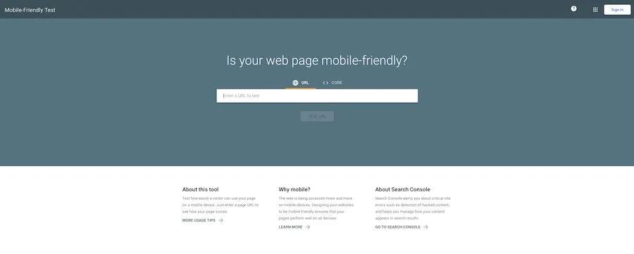
There are three possible results. Either your site is mobile-friendly, not mobile-friendly, or there’s no data available.
If Google claims your site is not mobile-friendly, it will show you a list of possible errors that you can work on.
2. Find Out What Your Audience Wants
If you’re planning a website redesign, you should find out how customers interact with it. One way to determine its mobile-friendliness is to compare analytics for desktop and mobile users.
If you notice a higher bounce rate for mobile visitors — or those who navigate away from your site almost instantly — that’s a dead giveaway of poor user experience. The next ideal step is to ask customers which of your site components needs improvement.
Maybe mobile users have trouble viewing your site on their phones or can’t navigate through the pages. Remember, customer feedback will reveal user experience features you might otherwise miss.
3. Design Your Site With Mobile in Mind
Before, web developers built sites based on the needs of desktop users. They created code to display on beautiful full-screen devices.
However, as consumer needs change, your strategies should evolve with them.
Today, you have to design your site with smartphones and other mobile devices in mind. It’s the first rule of adapting to the mobile-first design concept.
Here are some elements to consider:
- Limited display space: Consider the available screen space for mobile phones and the vertical manner consumers use them to read content.
- Content marketing: There are many ways to elevate your site’s design, but create standout content first before doing so.
- Easy navigation: Make sure that site visitors can jump across your pages without getting overwhelmed with button choices.
4. Optimize Your Resources
Sometimes, it’s easy to choose personal visual preferences over user experience. Showing creativity on your website can be exciting, but it’s still best to understand how media optimization works.
For instance, it’s easy to fill your pages with videos, photos, and icons. However, these elements are the biggest bandwidth consumers on most sites.
Below are some practical tips to prevent your site from using too much unnecessary space:
- Resize images: Stay in the 600 to 700 px range for mobile devices. There’s no reason to go any bigger.
- Compress color components: You can use third-party software to minimize the number of colors in an image. This helps reduce file size.
- Explore different file formats: Apart from PNG and JPEG, check out newer ones like WeP and SVG.
5. Be Conscious of Your Loading Speed
The average website page load speed is 15.3 seconds. However, Google recommends a loading time of only two to three seconds.
As mentioned earlier, image size, color compression, and file formats sometimes take up too much website space. When this happens, your load speed suffers.
Keep in mind that page speed is crucial for user experience and SEO. Pages that take too long to load often experience higher bounce rates and lower average visit times.
The key to success lies in balancing your story and the tools to speed up your page. Once you achieve this feat, you’re well on your way to digital success.
6. Simplify Your Navigation Menu
Mobile devices are substantially smaller than their desktop and laptop counterparts. For this reason, you should simplify the navigation menu and keep it as short and sweet as possible.
If you don’t optimize this feature, your lists might end up longer than your phone screen! Try using the hamburger-style menu — that three-lined icon you often find on your phone.

This menu style has gained popularity over the years for mobile websites because they take up less space on the screen. Apart from navigation ease, it gives way to other website components.
You can place one at the top of the menu. Once visitors click on them, they can grow and become more easily clickable.
7. Simplify Your Forms
Are you planning on adding forms to your websites, such as contact forms, event registrations, surveys, e-commerce checkouts, or appointment bookings? We recommend you do so because they can do wonders for your lead generation and nurturing efforts.
However, it’s harder for visitors to fill out details from their mobile devices than from desktop or laptop devices. The best thing to do is to minimize the number of forms you add to your site.
Also, keep these files short by asking only for vital information. You can use drop-down menus and checkboxes for your mobile site.
8. Redesign Pop-Ups
Pop-ups get a lot of hate, but they are still one of the most effective ways to grab a visitor’s attention. As long as you strategically position these components, it shouldn’t be a problem for potential clients.
Here are a few pro tips for redesigning your pop-ups:
- Make them as non-obstructive as you can. They should only occupy a small portion of your screen.
- Pop-ups should be easy to close. If you’re using an exit button, make sure it’s clearly visible to your website visitors.
- Use colors well. Avoid using flashy designs like olden websites did.
Also, you can use pop-ups for crucial information like age verification or General Data Protection Regulation (GDPR) notices.
9. Choose a Reliable Host
One of the most overlooked aspects of designing a website is picking the right web host.
Remember, your plan should provide you with the speed and resources you need to power your mobile site. No matter how much time and effort you spend on your site, it won’t matter if your host is not the right fit for you.
There are free website hosting services available in the market, but we wouldn’t recommend them for growing businesses. Trust us, investing in a reliable hosting plan can help you take your site to the next level.
10. Test Your Site Before Relaunching It
Lastly, it’s crucial to test your site before launching or relaunching it. Many things could go wrong with your site, but you should catch them before you lose any potential clients because of such errors.
Here are a few tests we recommend running:
- Browser testing: Remember to compare your site’s behavior across different browser environments.
- Design testing: Use different devices to access your website. Doing so helps you determine how mobile-friendly it is.
- Speed testing: You can use tools to determine how fast your site is and discover ways to speed it up.
- Broken link testing: Low-quality links can affect your customer relationships and your SEO efforts. Make sure all your links work as they should.
- Readability testing: These tools identify how easy or difficult it is to read your content.
Create a Mobile-Friendly Site Now
Now that you know how to optimize your website for mobile, it’s time to elevate your pages. However, this process takes a lot of time and effort if you don’t have a team of experts by your side.
At Search Click Grow, we know what it takes to build a mobile-friendly site. We’ve helped hundreds of small and medium-sized businesses achieve their goals through such platforms.
Are you ready to dominate online spaces? Our specialists can help!
Schedule a no-obligation breakthrough call now to determine if we are the ideal partner for you.