
A landing page, simply put, is any page you direct visitors to from a link. Or, more succinctly, a page that a visitor “lands” on after clicking a link. There’s a variety of types and purposes for landing pages, but most serve as destinations for marketing and advertising campaigns.
Although related, marketing in general is about creating awareness of your brand or service, and lead generation focuses on getting people to raise their hand and say they're interested.
This blog will focus on the anatomy of a landing page designed to capture information and convert visitors into a lead or a sale with a singular focused offer.
"Featuring more than one offer on a landing page can decrease conversion rates by as much as 266%" — Wishpond
Landing pages are so powerful at converting more traffic because they’re singularly focused on one goal (or call to action) by only providing the visitor with information about a specific offer or product. The simplicity keeps a visitor focused on that one goal by blocking noise and distractions that might pull users away from converting.
But before we dive right on into what to slap on a page to make it work to convert more leads, we need first to understand the motivation behind the slapping...
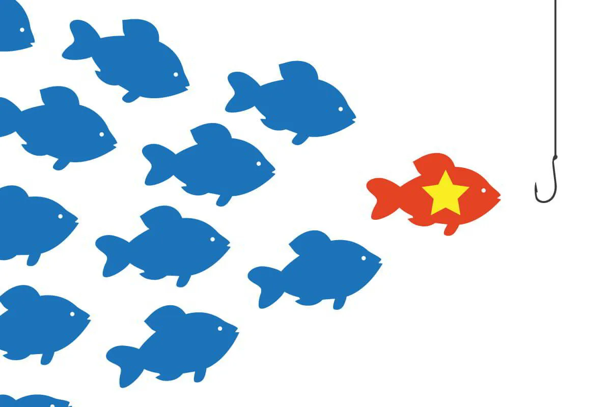
Be the Fish Everybody Wants
I wrote a pretty in-depth article a while back about using Data-Driven Marketing techniques in order to influence customer behavior. A large part talked about how understanding what consumers want and need is important— and ideally, before they even realize it. Its an ongoing imperative for marketers like me who are armchair psychologists at heart.
However, influencing consumers with marketing and advertising has obviously shifted dramatically and drastically away from the old-school, Mad Men approach of flashy, pandering slogans on billboards and full-page magazine ads.
The accessibility and reach of the internet have become the great business equalizer. Because of hyper-targeting features, eerily-accurate algorithms, and booming social communities, even the smallest one-man business can communicate and convert customers without needing a traditional big business budget.
But just because you can “reach out and touch someone” doesn’t mean they have to listen to what you say. In fact, there’s a whole ocean out there teaming with competitors vying for their attention.
We all know that in order to build a successful business, we have to give people a reason to choose us over our competitors.
But how do you go from being just one of many easily forgettable fish in the sea... to being the one fish that everybody wants?
Set Yourself Up for Success: Understanding Consumer Behavior
We as consumers are not as street-smart and savvy shoppers as we’d like to think we are— and understanding this has always had hugely profitable implications for advertising, marketing, sales, and branding.
We’re predictable. Modern online users almost universally follow a standard process when they make their purchases or contacting decisions online.
“People buy on emotion and justify with logic.” – Zig Ziglar
You may have heard that famous quote before… but what does it mean?
The brain processes emotion and logic very differently, but they are intertwined deeply when it comes to our decision-making. Emotions are pretty dang quick to let us know when we want to buy something… but logical persuasion uses facts and figures to convince us why that purchase makes logical sense.
Ultimately, people act on their emotions and justify that decision to themselves logically. They don’t just buy products or services – they buy solutions to their problems.
But it’s not an immediate “step A to step B” light switch decision when we click that “contact us” or “buy now” button… you’re actually moving through certain sequential stages of thought.
The most common is a concept called the A.I.D.A model.
The A.I.D.A. Model: A Tried & True Classic
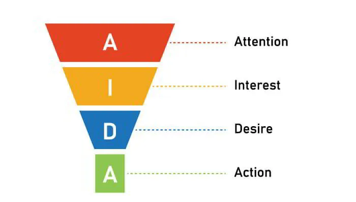
The A.I.D.A. model describes the typical customer journey through Awareness, Interest, Desire, and then Action— and it is possibly one of the best-known marketing and customer behavior concepts out there.
It was developed based on psychological principles and techniques— and it’s especially easy to adapt and implement for landing pages.
To tap into the power of the A.I.D.A. concept successfully, both the design elements and copy of your landing page need to work together to communicate a specific message and subtly guide a visitor towards your most desired conversion action.
Here’s the A.I.D.A. model as it would apply to a landing page customer journey:
1. ATTENTION
"What is this?"
In our information-overload world, you need to be quick and direct to grab people's attention. The goal of this stage is to cast a wide net and stand out to your ideal customer by piquing their curiosity.
2. INTEREST
"I like this."
While the first stage is aimed at capturing their attention, this next stage is all about holding it. Gaining a person's interest is a deeper process than grabbing their attention.
They’ll want to learn more about your brand, the benefits of your solution, and your potential fit with them. If you've successfully garnered enough curiosity, they will give you a little more time to do it— but you have to hone in on their needs in an immediately identifiable and understandable way.
3. DESIRE
"I need this."
The Interest and Desire parts of the AIDA model work hand-in-hand— as you're building the reader's interest, you also need to help them understand how what you're offering can actually help solve a problem or need of theirs in a real way. This helps in moving their mindset from “I like it” to “I need it”. This is when you’ve made your logical case for your product or service.
4. ACTION
"I'm getting this!"
At this point, the previous stages have weeded out the majority of unsure visitors, leaving only serious prospects. One of the biggest mistakes we see business owners and marketers make is not actually providing a clear next step.
At this fourth stage, it is crucial that you compel them to respond with low-friction but high-incentive calls to action. After all, what’s the point of creating content and building deep relationships with potential customers and clients if there isn’t a clear next step for them to take?
First Things First: Always Plan Your Landing Page
You wouldn’t build a house without a blueprint— or trust a builder who didn’t show you one first, right?
You’d most likely end up with a lot of wasted or missing materials, possibly a toilet in your kitchen, stairs that lead to nowhere, and a virtually uninhabitable building that would need A LOT of fixing. Shortcuts to planning just don’t work here.
Shortcuts don’t work when it comes to landing pages either— so don’t try to build your dang landing page without having a solid plan!
Here are three core steps to follow beforehand each and every time you want to create a new landing page:
1 – Determine the Purpose & KPIs:
It may seem obvious, but you first need to determine and define this landing page’s purpose.
Are looking for people to fill out a " request a free quote" form? Call your business to set an appointment? Download an ebook? Start a free trial? The purpose of your page will dictate the entire flow of the page, its copy, and more.
Next— define your conversion goals and key performance indicators (KPIs). It's not just the best way to accurately evaluate your page’s effectiveness after launch.
It’s also going to help ensure your page focuses on a singular call to action throughout its creation and dictate your areas of optimization after launch.
A Few Common Landing Page KPIs Include:
- Number of leads
- Lead Value
- Lead Quality
- ROAS - Return on Ad Spend (Check out our free ROAS calculator here!)
- Page views
- Average time on page
- Bounce rate
- Conversion rate
- Cost Per Lead
However, a common pitfall we see all the time is people start tracking too many things and then helpful metrics are lost in the sea of data overload. Only track what you need to.
We use the SMART goals concept to ensure we’re always focused on the right goals and determine which KPIs we should be tracking:
- SPECIFIC - Is your goal Specific?
- MEASURABLE - Can you Measure progress and track its success or short-fallings?
- ACHIEVABLE - Is the goal realistically Achievable?
- RELEVANT - Is it Relevant to the success of your landing page?
- TIME - What is the Timeline for achieving this goal?
2 – Define the Target:
Targeting and testing correctly can boost conversions by 300% or more. - STEELHOUSE
You wouldn’t write a letter without addressing it first. Whether you’re branching out into trying to reach new audiences— or engaging with your existing customers/clients— landing pages make it possible for you to deliver the right message to the right audience at the right time. Outline the answer to the following questions:
- Who is your ideal target audience?
- Why would they be interested in what you offer?
- What is the pain/problem you’re solving for them?
- How do you solve that?
- What makes you the best choice?
Having all these target market answers outlined and top of mind will help steer the direction of your landing page and ensure you’re always focused on them. Spend this time now so that you can get the biggest possible return on your time and money.
A Landing Page Is a Sum of Its Parts
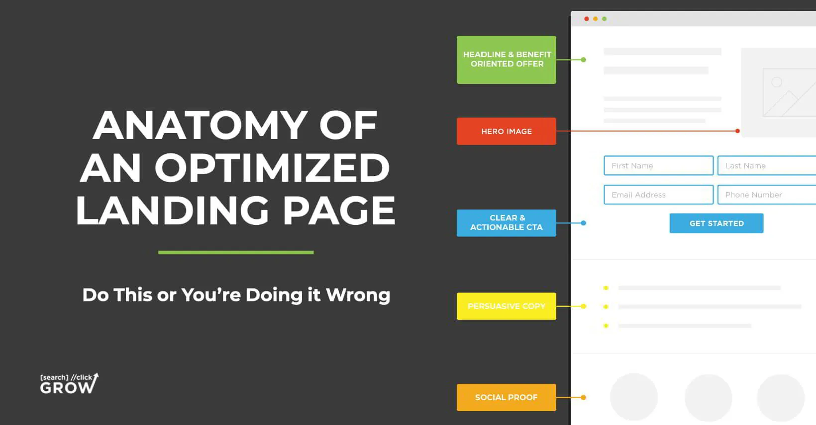
The Anatomy of an Optimized Landing Page
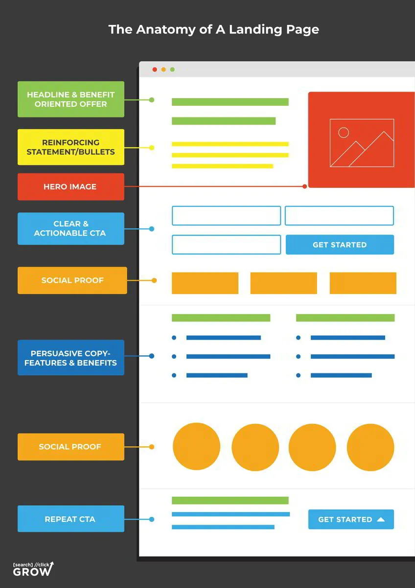
Let’s break down key aspects that all conversion-focused landing pages should have:
1 – Intriguing Above the Fold
The "fold" is a term that originally comes from the newspaper industry— wherein an eye-catching headline and/or graphic is appropriately positioned to snag the attention of those passing by at a glance. When positioned right, newspapers were more likely to be sold.
For your landing page, the above the fold section is the entire portion of the page that your potential leads can see without scrolling— and is going to be the first thing that visitors see.
Remember the old adage: “You’ll never get a second chance to make a great first impression?”
Would you show up on that ever-important first date in your sweaty workout clothes straight from leg day at the gym?
Would you call the hiring manager to schedule your dream job’s hard-to-land interview and open with a bad “yo’ mama” joke?
Well, I would hope not.
The above the fold section is a critical part of capturing and keeping your visitors’ attention. Above the fold content, on average, holds down 80% of users’ attention.
It needs to be clear, concise, and intriguing.
There are a few deviations you can take here if you’re a seasoned marketing veteran, but as a solid, tried-and-true standard formula, you should create your above the fold with the following things:
Hero Image - A Hero Image includes any eye-catching, and usually oversized or banner-type photo, graphic, or video that draws you in immediately and illustrates your offer perfectly. It’s the “hero” of your page that saves the day by saving your bounce rate. It’s usually placed as a background layer underneath the header text or above the content block, and it corresponds and enhances your headline— not distract or detract from it.
Message Match Headlines & Details - Message Match measures how well your landing page matches the phrasing of the ad or link that brought the visitor there and affects your ad quality ranking.
It also increases conversions— reassuring people they’ve come to the right place. You'd be pretty disappointed if you clicked on an ad for vintage purses... but then landed on a page talking about vintage wallets. Even though they're in the same basic "family", that seemingly minor discrepancy can mean a major loss of potential leads.
Sum up the main value of your product/service in just a few words with a strong Message Match in your main headline and its supporting/reinforcing statement and/or value bullets. The headline could be a value proposition, or it might describe what the visitor can expect from your product or service.
The important thing here though is to keep your focus on the benefits and impact you'll make on the visitors' lives, not the features of your product or service.
Clear and Actionable CTA – The above the fold area is also the prime spot to include your CTA using a button or an embedded lead capture form. Having this here doesn’t necessarily mean that your visitors won’t scroll down the page to read more information, but ideally, the eager beavers whom you’ve convinced ALREADY will have an immediate way to take action.
2 - Scannable & Usable
The average attention span of today’s digital users is around 8 seconds but is likely even lower among younger age groups, according to Microsoft research. What this means for your landing page is that the slightest inconvenience or point of confusion can be the major roadblock to a conversion.
Skipping back to its base level, the first milestone that an optimized landing page must achieve is to be functional. It shouldn’t have any technical issues, slow load times, broken images, illegibility, or any other distractions that create friction or even distrust in a visitor’s on-site journey.
Speaking of friction, you’ll know how much we stress the avoidance of the dreaded “wall of text” if you’ve read any of our other blogs about optimized content marketing and copywriting—
You need to make sure you highlight key points and break up paragraph text with headlines, bullets, and supporting imagery. (This won’t be an issue if you followed our planning tips from the section near the beginning of this blog.)
Your headlines and hierarchy of supporting text needs to make so much instant sense that visitors catch the basic essence and purpose of your page immediately upon scrolling— and the impactful message compels them to read more.
Basically— the entire flow and every aspect of your landing page needs to be effortlessly easy to use and coherent to your message.
3 – Social Proof Builds Instant Trust
The strategy of incorporating social proof into your landing page is extremely important to:
- Build trust
- Increase credibility
- Validate and guide the customers’ buying decision
Social proof is like online word of mouth and positive peer pressure. It adds trust and credibility to your brand which leads to more appointments, sales, conversions, etc.
"When you use compelling social proof on your landing pages, you can more than double your conversion rate." — TrustPilot
But testimonials and online reviews aren’t the only example of social influencing— here's a quick hit-list of social proof elements that you can reference when gathering trust indicators for your landing page:
- “As seen in” logos
- Online reviews
- Client testimonials
- Awards
- Clients/companies helped
- Celebrity/influencer endorsements
- Before & after images
- Gallery/portfolio of work
- Press & media mentions
- Certifications & training
- Trust badges & seals - an icon illustrating payment SSL or guarantees, warranties, etc.
- Brand statistics – number of customers, years in business, social shares, range of countries/states, etc.
- Case studies
Try to incorporate at least 2 of these examples on your landing page to really amplify that trust factor.
4 – Persuasive Copy: The Dream Team of Features, Benefits, & Urgency
Not all landing pages are the same. Some industries require a lot of information on the page, and for others, a simple headline, supporting bullets, and a form fill is sufficient. Plus, the intent can be different. Getting a free lead magnet is much less of a commitment than booking a free consultation.
The bottom line is every single aspect of the copy on your landing page needs to build interest, provide information, and motivate action. Anything that doesn’t fit into those categories is just “fluff” and ends up detracting from your overall message.
Features & Benefits are NOT the Same...
In order to persuade your on-site lookie-loos to convert into motivated leads, you need to write persuasive copy – focus on features, benefits, and the impact that your product/service brings.
Features - Facts and/or functions about products or services: "This suitcase carry-on has a has a built-in front pocket."
Benefits - Explain how your product or service improves and makes an impact on their lives: "Get quick-access to essentials like boarding passes."
Use the "So What?" Principle to Help Write Your Benefits-
Every time you write a piece of copy that you think is a benefit, ask yourself, “Is the reader likely to say, ‘so what?’ after reading it?” If so, it’s not a strong benefit and needs improvement. A core tenet of a solid benefit in the marketplace is your ability to help your visitors see the benefits of you in as few words as possible. It's tricky to achieve but not impossible
For example:
This is the fastest preheating oven on the market— being ready to cook in less than 3 seconds.
So what?
This oven is ready to start cooking your lasagna faster than any other oven.
So what?
Don't worry about timing dinner preparation with this oven— your dinner is ready to cook sooner and on the table for your family faster.
SO WHAT?
Less stress and more healthy home cooked meals for your busy family- No more take-out or late dinners again just because you forgot to preheat your oven.
Remember— you already care about your product or service... it's your job to tell your visitors why they should too.
Address Objections BEFORE They Have Time To Even Think About Them Themselves
Below is a checklist of common objections that a person may have before making a decision. Pretend your ideal customer is asking you these – then incorporate answers to all the applicable ones to preemptively remove those objections and reduce barriers to conversion.
- What EXACTLY am I going to get?
- Who is this for? Who is it not for?
- What and how will it help me/solve my problem?
- How will this make my life better?
- How long till I start seeing results?
- How easy is this to do/get?
- What’s the time commitment and is it worth it?
- Is there a guarantee?
- How do I know I can trust you?
- Are there others that can vouch for this?
- How much is it going to cost me?
- How do I pay?
- How do I get it?
- What will happen if I don’t do/get this?
Sections on your landing page that you can incorporate these topics into can be:
- Process/about/story
- Features
- Benefits
- Impact
- Q&A/FAQ section
- Comparisons to competitors
- Images and video that relates to copy
"Addressing buyer fears on landing pages can increase conversion rates by 80%." — gripped.io
Providing value and swatting down objections are only the build up of writing persuasive copy... GIVE THEM FOMO!
Your copy may have them convinced that what you have is what they need and reduced all their decision barriers preemptively... but how do you push them to take action right then and there instead of waiting for some other time?
You do this through adding URGENCY throughout your headlines, copy, and CTAs. There are two common ways this can be done:
One way is addressing the aspect of TIME. Paint a picture of what could happen if they don't act, and make it as clear as possible that time is running out.
- What will happen if they don't act now?
- Will they miss out on a great opportunity?
- Will they be left behind while others take advantage?
The other is adding SCARCITY. Studies have shown that humans have a tendency to perceive things as more valuable when they’re limited. If there's only a limited supply or openings for what you're offering, be sure to make that clear and highlighted in your copy.
It's important to be confident and direct in your language, and avoid anything that sounds wishy-washy or uncertain. If you make it clear that you expect people to take action NOW, they likely will.
5 – Provide a Next Step
A strong landing page thrives on clarity— clear pricing/offer, how to join, how to start, etc… Because this is a lead generation landing page, you want to be SUPER transparent about what they need to do now and what’s going to happen next.
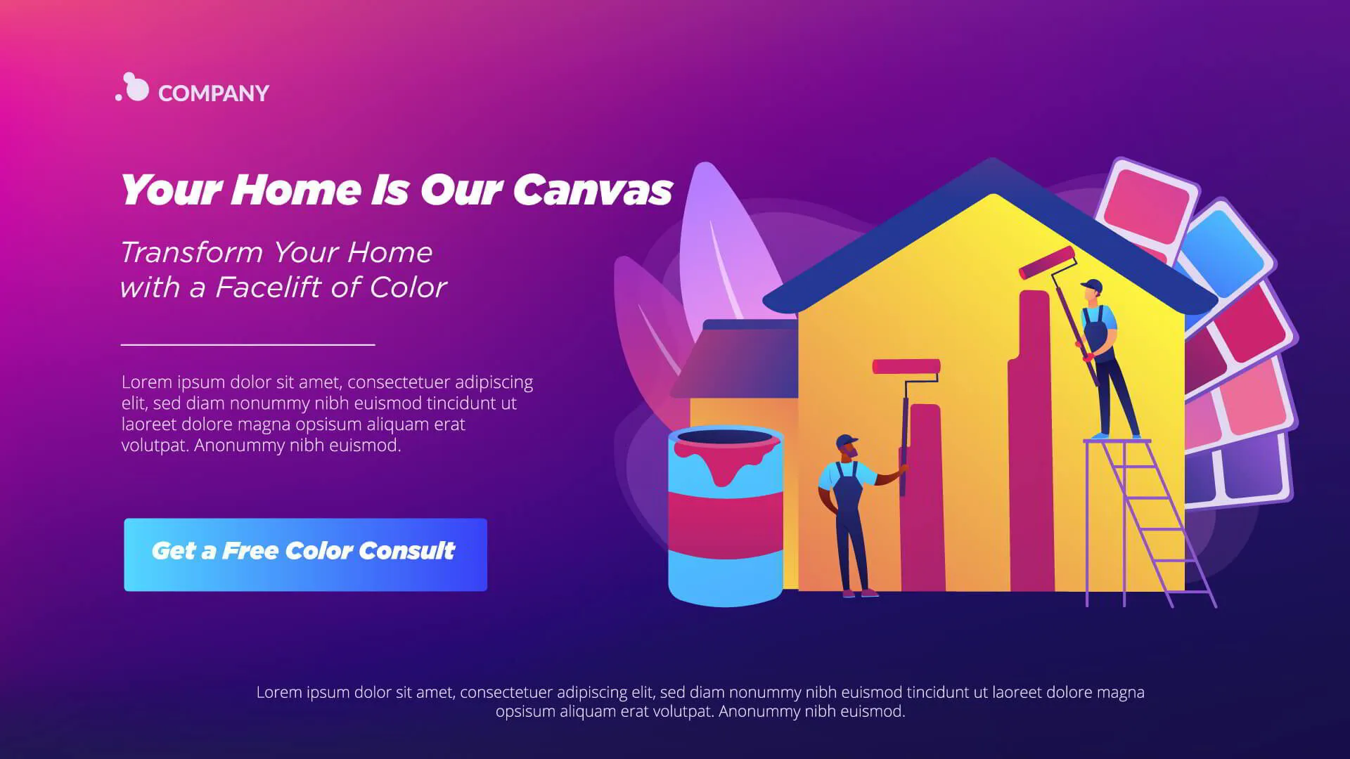
If someone wants to get a quote to repaint their home’s exterior, you want to let them know to fill out the form and that you’re going to give them a call within 24 hours to schedule a time to come by to look at their property. That way, there are no surprises or questions and they don’t just go seek out other options.
On-page contact info/conversion form
Your form should capture enough information so that you can follow up in a customized manner, but not so much information that it takes what seems like extra time or thought to fill out.
A good rule of thumb is to have seven fields or fewer. Name and email are a safe bet. Ask for a phone number and address only if it’s necessary. Then you may need to get additional details to qualify or score your leads.
Repeat your CTA on long pages
It’s also a best practice to include your CTA multiple times on the page, especially for long landing pages. That way, any visitors reading your supporting copy won’t have to scroll back up to convert— as minor of an inconvenience as that may sound, it can cost you major quantities of leads.
Exit intent popup (last ditch offer)
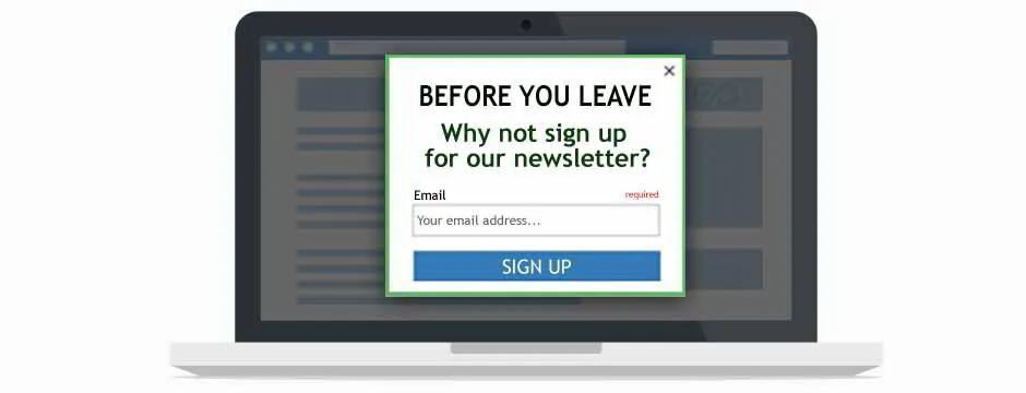
Exit-intent means tracking mouse movements and scrolling behaviors of your page’s visitors and detecting when a visitor is about to leave your website. Then, an exit-intent popup is displayed when a visitor decides to bounce.
This area allows you to add additional value, try to persuade, or even offer an additional discount.
But remember – an exit intent pop-up is a last-ditch effort at a conversion. As soon as a user sees this pop-up, it means that your page – and the sales funnel surrounding it – has failed.
You want the vast majority of visitors to never even see your exit-intent pop-up because your landing page is so well-optimized for conversions that most people never make it that far.
If you’re strategic about using exit-intent pop-ups as a safety net to reduce the number of leads slipping away, then you’re approaching things from the right angle. If you’re using them to make up for the failings of your page, then you’re doing it wrong.
Technical Launch Checklist
One of the worst feelings after carefully crafting your super awesome landing page is realizing something is broken, unusable, or a negative flag for Google Ads AFTER you’ve already started throwing ad campaign dollars at it.
- Below is a quick list of things to check and test before you hit that “launch button.”
- Check mobile responsiveness on multiple device types
- Ensure a thank you page is created and redirected to
- Create, install, and test scripts and pixels that have conversion events or goals created
- SEO Title and Meta with keyword
- Keyword in URL
- Keyword in main headlines
- Keyword in image alt-texts, titles, and captions (if applicable)
But Wait! There’s more… Testing & Ongoing Optimization Tips
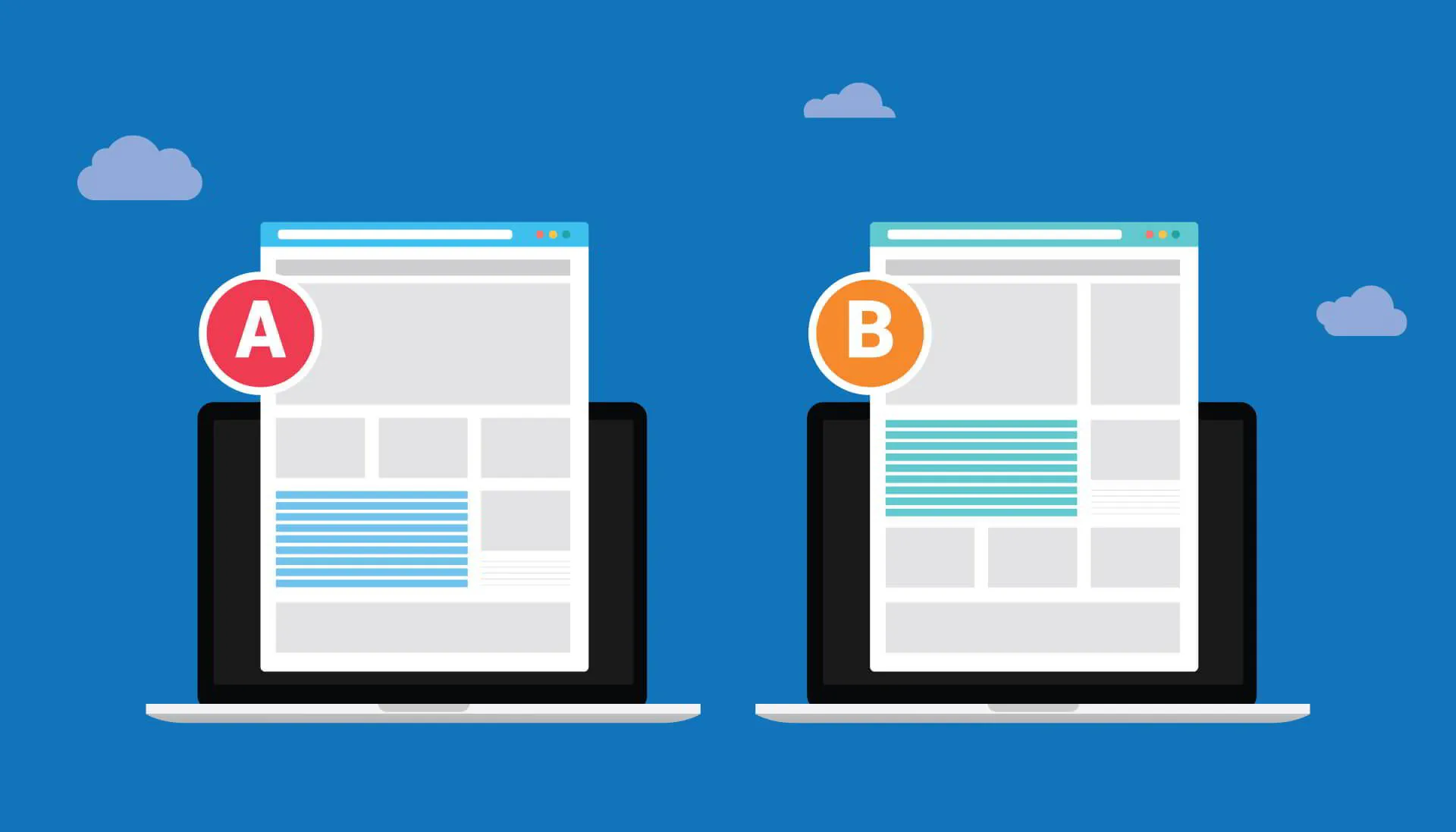
Ongoing landing page optimization is crucial to ongoing success. A/B testing is for optimizing your landing pages since you can never simply rely on a hunch or gut feeling when guesstimating what will work best for your target audience when conversions are at a lull.
Test different elements, but only one at a time or you won’t know what change impacted conversions.
- CTAs
- Headings
- Button size and placement
- Number of form fields
- Images/videos
- Right, left, or center column design
- Colors of buttons, headlines, or other elements
- Pricing/Discount
- Offer details
- Social proof details
So in conclusion…
Today’s consumers have an over-abundant wealth of information at their fingertips — blogs, online review sites, social media channels, local listing services, youtube videos, online courses, and so on. Thanks to this, most customers know what they want, who they want it from, and sometimes… even what they want to pay for it beforehand.
Growing your business means reaching potential customers before they’ve made up their minds. Lead generation funnels with highly optimized landing pages solve many of the age-old difficulties of locating, connecting, and doing business with new customers who may not know you even exist.
Remember: with a lead generation landing page you’re not just asking for someone’s email— that's a low resistance commitment. You’re also asking someone to fork over their real name, possibly their phone number, and sometimes even their home address. That's quite a bit more personal.
So whatever you’re offering— whether it’s a free quote, a complimentary consultation, or otherwise— your entire customer journey from potential lead through loyal repeat customer better be seamlessly compelling and your followthrough flawless.
Want to see what a highly optimized lead funnel would look like for your business? Contact us today to schedule a no-obligation breakthrough call and get a free, customized roadmap for growth!