What Is Color Psychology & 3 Tips for Website Design and Branding
Posted on
Color psychology plays a big role in web design and branding. It’s a powerful tool that can have a significant impact on how your audience perceives your business.
The colors you choose for your website and brand can evoke different emotions, convey messages, and even influence purchasing decisions. So, it’s important to choose your branding colors wisely and strategically.
In this article, we’ll explore what color psychology is, and how it impacts your customers’ perception of your business. We will also provide you with three color psychology tips to help you create a memorable online presence.
Whether you’re just starting out or looking to revamp your brand, these tips will help you in creating a visual identity that resonates with your target audience.
Let’s get started!
What Is Color Psychology?
Color Psychology is the study of hues and how they can determine people’s behavior.
Most people have color preferences if not an absolute favorite. Everyone can associate a color with something meaningful in their lives.
- Some kids go through phases where they refuse to eat foods with certain colors.
- Colors can tell us when it’s safe to go through the intersection or not, without saying a word
- Color is everywhere, and so is color psychology.
Little did we know we were being introduced to color psychology in our formative years.
Now obviously Kermit has discovered his love for the color green– he created an emotional attachment to the color.
Emotions dictate our actions every day. Color can be a powerful tool when used to influence other people by manipulating their emotions.
The psychology of color and how it can affect us is a case of classical conditioning based on emotion and experience. Unquestionably, the subtleties of which for all of us can be on a subconscious level.
A Color Test on Testing
In one study conducted by the University of British Columbia, a researcher paired different colored pens with pleasant or unpleasant music.
At the end of the experiment, participants were more likely to take home a colored pen that was paired with pleasant music.
Additionally, those same researchers conducted tests with large groups of people to determine whether a person’s cognitive performance could be affected by whether they were exposed to two primary colors: red or blue.
Participants performed tasks with words or images displayed against red, blue, or neutral backgrounds (as a control) on computer screens.
According to their findings, the “red” groups did better on tests of recall and attention to detail, like remembering words or checking spelling and punctuation. “Blue” groups did better on tests requiring imagination, like inventing creative uses for a brick or creating toys from shapes.
The scientists concluded that tasks requiring enhanced memory and concentration are best done in a red room while conducting a creative brainstorming session is most effective in a blue room.
Where am I going with this?
Colors affect your mood and emotions. They affect your opinions, they affect your actions and decisions, and they are an unavoidably important factor to take into account when optimizing the effectiveness of your website design.
Tip #1: Color Influences Your Brand’s Perception
Color evokes feelings. Do you think it’s an accident that McDonald’s chose a bright red background behind those iconic Golden Arches?
Or that Blue Cross Blue Shield’s cross and shield are… blue?
These are carefully and meticulously calculated brand decisions made by color psychology and branding experts.
There’s a multitude of colors with a wide range of emotion-evoking connotation contrasts.
But, here are a few of the basics and the boilerplate feelings they can evoke for the average person:

Red
Positives: Passion • Strength • Stimulation
Negatives: Hunger • Danger • Violence

Blue
Positives: Trust • Security • Serenity
Negatives: Un-appetizing • Sadness • Detachment

Yellow
Positives: Optimism • Cheerful • Creativity
Negatives: Caution • Anxiety • Cowardice

Orange
Positives: Warmth • Exciting • Fun
Negatives: Immaturity • Frivolity • Frustration

Green
Positives: Balance • Fresh • Nature
Negatives: Jealousy • Boredom • Stagnation

Purple
Positives: Royalty • Spirituality • Vision
Negatives: Indulgence • Suppression • Moodiness

White
Positives: Hygienic • Pure • Clean
Negatives: Sterile • Cold • Unfriendly

Black
Positives: Sophistication • Luxury • Mysterious
Negatives: Oppression • Heavy • Menacing
Consider Your Target Audience before choosing your colors
Always consider your target market before choosing a color scheme. It’s not always as black and white (color pun intended) as the examples above.
Other factors come into play with people’s associations with color based on their past experiences, culture, and even gender.
Industry
For example, a bank teller might associate the color green with money, while a farmer would think of nature and freshness.
A fashion designer might associate the color black with elegance and luxury, but for a funeral director, it may evoke feelings of mourning, sadness, and loss.
Culture
Do your due diligence as colors might possess harmful meanings in another culture if your website or targeted marketing campaign is going to be viewed internationally.
American culture associates black with death, in contrast to death being associated with white in Asia. It’s purple for Brazilians.
A study called “Issues of Corporate Identity in East Asia” took a deep dive into cultural differences with brand perception as companies in the US were seeking to compete with businesses in Asia.
What the author found was America’s prime corporate color, blue, has a strong connotation of trust and security for us in the states.
However, blue is considered in East Asia to be a cold color with associations of evil and sinister behavior.
Gender
As a society that reinforces gender stereotypes, being male or female can influence what color you are most drawn to and our expectations.
Because most children feel a need to conform to their gender, males become drawn to blue, whereas females become drawn to pink- and that can carry into adulthood.
Look in any drugstore deodorant aisle. You can easily pick out which shelf has delicate, flowery female products with pink and purple hues and pastels. These are sectioned off from the overtly macho-manly products packaged with strong blacks, grays, and blues.
Today, most parents would get strange looks if they dressed their baby boy in pink.
Yet this was the norm a hundred years ago.
A June 1918 article from the trade publication Earnshaw’s Infants’ Department said, “The generally accepted rule is pink for the boys, and blue for the girls.”
The big shift happened in the 1940s. This was a result of Americans’ preferences dictated to them by manufacturers and retailers and advertising.
SIDE NOTE: Want to know why most hyperlinks are blue? Red and green are the colors most affected by color vision deficiency. Almost no-one has a blue deficiency. That means nearly everyone can distinguish blue as being different from its surrounding colors. Check out this article on designing accessible websites for the visually impaired. And DEFINITELY do some research on ADA compliance!
Tip #2: Want to Increase Conversions or Desired Action? Your Color Choice Matters!
A major and fundamental aspect of marketing is understanding how people think… and why they think it.
The perception of your website can be affected by your color choices in a multitude of aspects. This even includes the perception of website loading times!
An in-depth study by researchers at Hong Kong University found that cool, relaxing colors like blues, greens, and purples reduced perceived wait times.
Stimulating colors like reds and oranges increased perceived wait times… even though the sites loaded at the exact same speed.
Color and Conversions
Dmix conducted a test in which they pit green and red button colors against each other.
In their testing with 600 subjects, they found that conversions increased by 34% when they used the red button.

HubSpot conducted a similar test and their result was that the red button outperformed the green button by 21%.
ive textWidget col20″ data-type=”TextWidget” data-delay=”” data-animation-duration=”” data-animation-delay=”” data-animation=”lazyAnimation-“>
Those aren’t small potatoes– a 21-34% conversion rate increase could be HUGE for your business.
Contrast Makes Things POP
Moreover, you can use color to your advantage to capture people’s attention and drive an action.
Visually salient stimuli naturally and unavoidably capture our attention. Visual salience (or visual saliency) is the distinct subjective perceptual quality that makes some items in the world stand out from their neighbors and immediately grab our attention.
If one color dominates your page, and that color is also used for your CTA (call to action), it won’t stand out and it will be overlooked.
If you want to guide attention towards something like a CTA button, choose a color that contrasts with the surrounding environment.
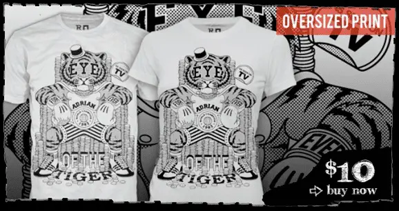
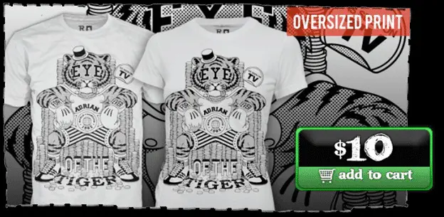
Ript Apparel saw a 6.3% increase in sales – just by simply adding an eye-catching button. Check out their before and after and see if you can spot the differences:
BEFORE —-> AFTER
Tip #3: Don’t have an Ugly Website
Have you ever been accosted by a cacophony of color that makes your eyes feel like they’ve been assaulted by psychedelic machine gun skittle bullets? Or trudged begrudgingly through the bland and lumpy oatmeal doldrums?
I think it’s pretty safe to say we’ve all visited a website that made us sit back and say to ourselves, “oh no baby, what are you doing?!?!” We know what kind of a nightmare dealing with ineffective web design can be.
You were promised a brilliant website design, but all you received was a big, hot mess. And if you feel personally attacked right now, you may need to fire your current website designer.
Why Color Contrast Matters In Web Design?
Another issue that we’ve come across is near-illegibility due to the low contrast between your copy and the background.
- Neutral colors like black, white, and grey are ideally used for the background.
- Use brighter colors for details and other foreground elements.
With not enough contrasting colors, like in the “before” example above, your important details get overlooked. Your eyes can’t immediately discern what’s supposed to be the focus.
Too many colors can be unnerving as well. Most people would never leave the house wearing the clashing colors they pile on their websites.
If you wouldn’t want to look at them, what makes you think your visitors would?
Besides attracting visitors like a moth to Times Square at night, basic website design rules dictate that it should effectively display the message you’re trying to present.
This includes your business objective, plan of action for visitors, and the quality content you’ve worked so hard to create. You should treat each page as a journey for your visitors. Guide them down the path toward your most desired goal.
First Impressions Are EVERYTHING
Would you show up on that ever-important first date with your sweaty workout clothes straight from leg day at the gym?
Would you show up to your dream job’s hard-to-land interview wearing your favorite, slightly stained sweatshirt you still have from your high school band trip?
Remember the old adage: “You’ll never get a second chance to make a great first impression.”
It’s a legitimate statement as it takes about 50 milliseconds (that’s 0.05 seconds) for users to form an opinion about your website. That opinion determines whether they like/trust your brand and your site… or not.
According to research from Stanford, 75% of users admit to making judgments about a company’s credibility based on its website’s design.
Studies also suggest that people make a subconscious judgment about a product within 90 seconds of initial viewing and up to 90% of that assessment is based on color alone.
Conclusion
So in closing, if your site is hard to use with unappealing/conflicting colors and is poorly designed, you’re gonna have a bad time.
Undoubtedly, color psychology is an important aspect of website design and user experience, but not the only one.
Contact us today if you’re ready to amp up your website to become a lead-generating powerhouse!