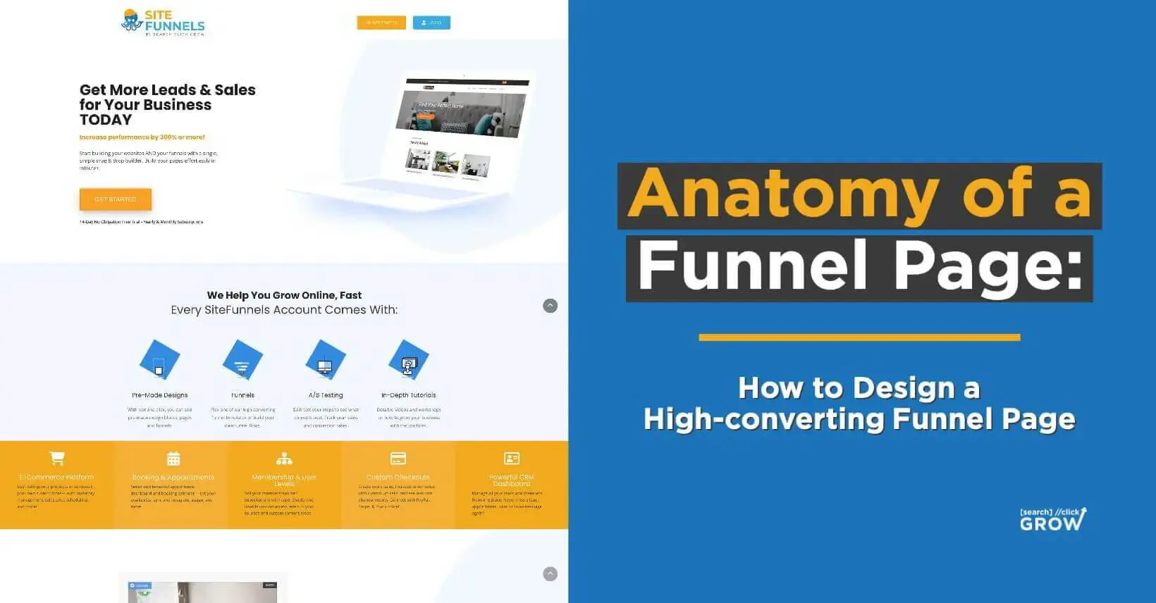
Anatomy of a Funnel Page: How to Design a High-converting Funnel Page
In today’s digital world, having an effective funnel page is essential for any business that wants to capture leads and convert them into customers.
A well-designed funnel page can make all the difference between a visitor clicking away or signing up for your service.
But how do you create a high-converting funnel page?
It takes more than just slapping together some images and words — it requires careful consideration of elements like attention-grabbing headlines, captivating visuals, compelling action words, and time limits on special offers.
In this blog post, we’ll look at the anatomy of a funnel page and explore how to design one that will get results.
Funnel Landing Page vs. Website Page
The difference between a website and a funnel page is the intent of their design.
While a website typically provides multiple pathways for visitors, a funnel page is designed to move visitors towards one specific goal — in this case, converting them into leads or customers.
Funnel pages are designed with simplicity in mind, with fewer steps and distractions than websites.
A website might encourage visitors to do different things, such as:
- Browse through different sections
- Learn more about the company and its services
- Get in contact with customer service or sales representatives
- Shop online
It can have numerous goals, including building brand awareness and showcasing products and services.
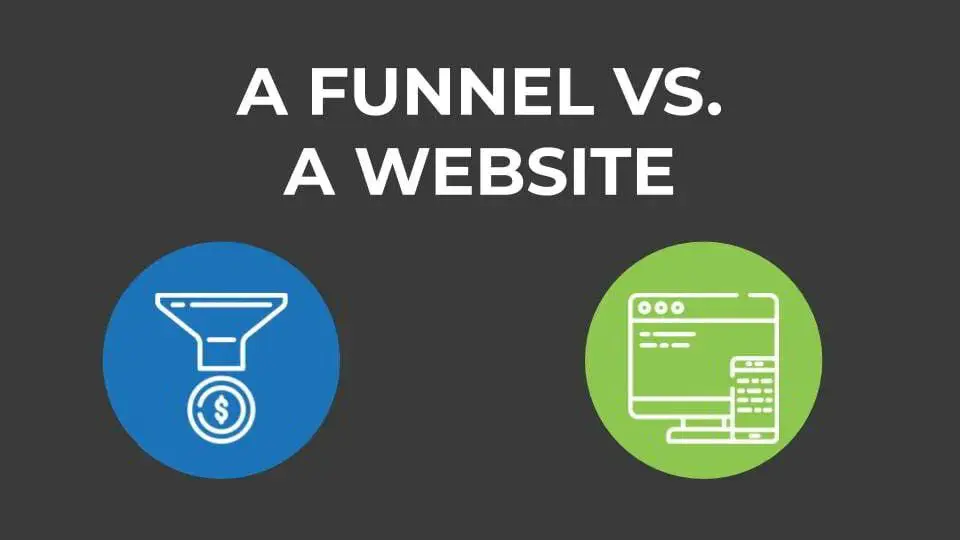
A funnel page, on the other hand, is built with one primary focus: to convert viewers into leads or customers by getting them to take action. These actions can include:
- Signing up for an email list
- Downloading an e-book
- Scheduling a consultation
Entrepreneurs and business owners often use funnel pages to increase website traffic conversions while decreasing the time they spend manually chasing leads.
By providing focused content that moves users through each step of the funnel quickly and efficiently, this page type helps ensure that those visiting your site are more likely to become paying customers.
They provide structure and guidance that help users make decisions quickly without overwhelming them with choices before they are ready.
What Is a Funnel Page?
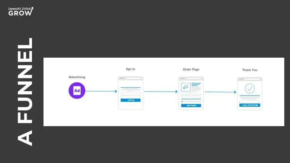
Also called a landing page, a funnel page is a standalone web page that contains specific information about an offer, such as:
- A product
- Service
- Event
Its primary purpose is to convert visitors into leads by providing valuable information in exchange for contact details such as an email address or phone number.
Funnel pages usually have a single call-to-action (CTA) that encourages users to take the desired action, such as signing up for a newsletter subscription or making a purchase.
Identifying Your Most Desired Action (MDA)
The goal of a funnel page is to help drive conversions.
Before designing your funnel page, you need to identify what action you want visitors to take after landing on it.
- Do you want them to sign up for a free trial? Subscribe to an email list?
- Download an e-book?
Once you’ve identified this goal, everything else should fall into place. Each element of your funnel page should be designed with that desired outcome in mind.
For example, if your goal is to get visitors to subscribe to an email list, then every page element should encourage visitors to do so.
Don’t try to cram too much information into your page — keep it simple and focused!
How Your Funnel Page Fits Into Your Sales Process
Funnel pages are the first point of contact for potential customers and serve to introduce the product or service being offered.
A well-designed page should provide clear and concise information about what customers can expect if they decide to purchase your product or service.
By creating targeted content that moves visitors through each step of the funnel quickly and efficiently, businesses can increase their conversion rates from website traffic while decreasing their time spent manually chasing leads.
Once visitors reach the funnel page, companies must have a plan to turn them into customers. This may include:
- Sending follow-up emails with additional information about the product or service
- Providing personalized customer support
- Offering discounts or promotions
- Providing incentives such as free shipping or other rewards for buying now
These tactics help increase conversions from those who have visited your website but are yet undecided about making a purchase decision.
What Is the AIDA Model?
Creating high-converting funnel pages requires understanding your customers’ psychological processes.
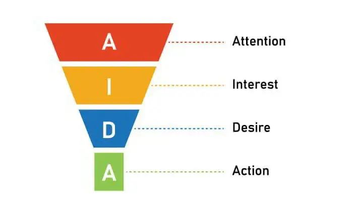
The AIDA framework is an effective tool marketers use to develop effective pages that drive conversions.
It provides a step-by-step guide to creating compelling content that encourages visitors to take the most desired action (MDA).
AIDA stands for Attention, Interest, Desire, and Action.
Attention
The first step in the AIDA framework is to grab your audience’s attention.
You want to create a compelling headline that speaks directly to their pain points, piques their curiosity, or makes them feel like they’re missing out on something significant.
Once you’ve hooked their attention with a headline, use eye-catching visuals and strategic formatting to keep them engaged.
A well-designed anatomy of a funnel page makes it easy for your audience to scan the page, so make sure it’s not cluttered with too much text or confusing graphics.
Interest
After capturing your audience’s attention, the next step is to nurture their interest in your product or service.
This stage involves highlighting the benefits of your product or service and demonstrating how it solves a specific problem.
You can reinforce these points further by showing what you do, who your customers are, and what they can get from your services.
Desire
Once you’ve piqued their interest, the next step is to create a sense of desire in your audience.
This is where you can showcase your unique selling proposition and differentiate yourself from the competition.
Highlight how your product or service can make their lives easier, save them time and money, or improve their overall quality of life.
Action
The final step in the AIDA framework is encouraging your audience to take action.
This is where you entice them to click that call-to-action button and convert.
Use robust and action-oriented copy emphasizing the benefits of taking action, such as “Start Your Free Trial Now!” or “Schedule Your Service Today!”
Make sure the button stands out visually and is strategically placed on your funnel page.
You can also use scarcity tactics such as “Only X spots left!” to create a sense of urgency and prompt immediate action from your audience.
Anatomy of a High-converting Funnel Page
Following the AIDA framework is a great way to ensure your page is optimized for conversions.
A well-designed funnel page should be focused, easy to read and understand, and visually pleasing.
It should also emphasize the benefits of taking action instead of listing features or speculating on potential outcomes.
Here’s how you can use the AIDA framework:
1. Hero Image and Headlines
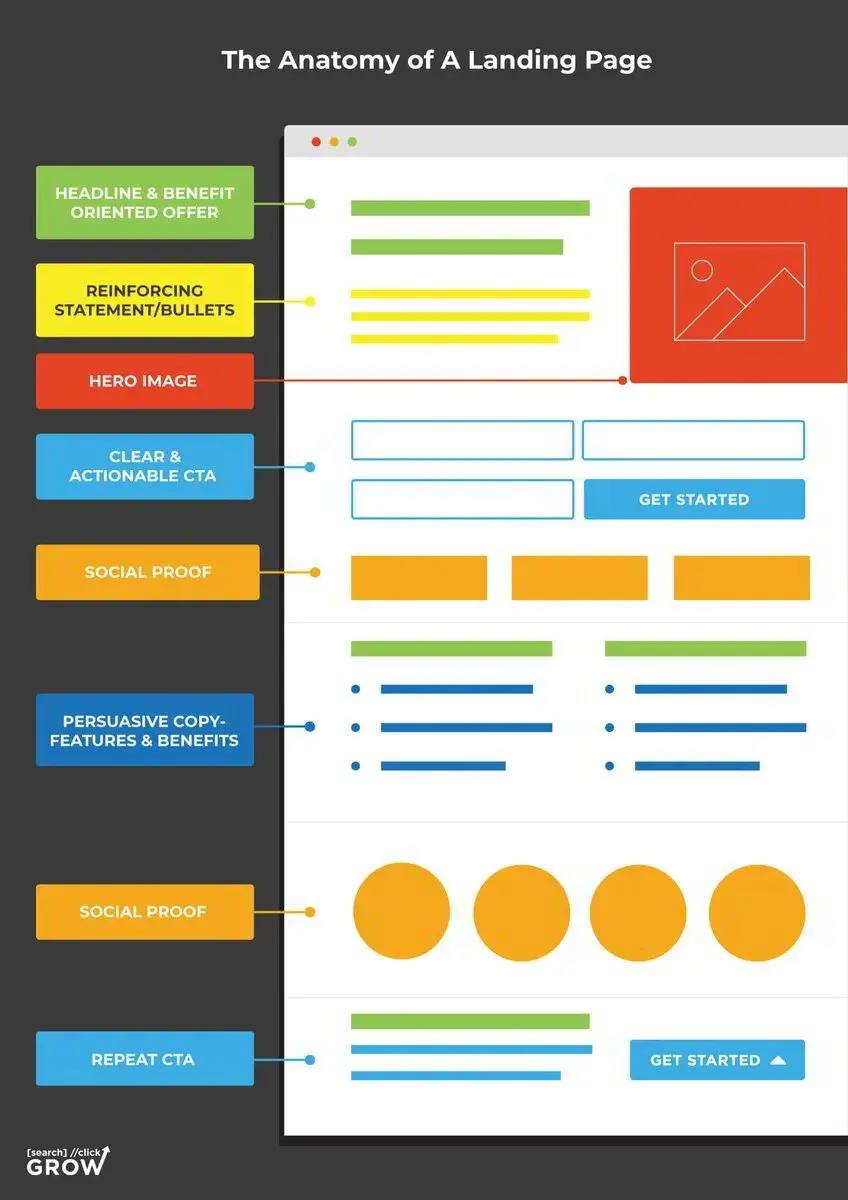
A hero image, also known as a banner image, is the first thing visitors will see when they land on your page.
It’s a large, high-quality image that conveys your message and captures your audience’s attention. Make sure your hero image is eye-catching and relevant to your message.
Your hero image should be visually appealing, relevant to your business or service, and communicate your unique value proposition.
The headline should be clear and concise and answer the question: “What’s in it for me?” (WIIFM) for your target audience.
A strong hero image and headline can compel potential customers to want to learn more about your business and service.
2. Reinforcing Statements and Bullet Points
Once you have your audience’s attention, you must reinforce your message to persuade them to take action.
Reinforcing statements are short phrases or sentences that reiterate your message and remind your audience why they’re on your page.
- Bullet points are a great way to showcase your product or service’s benefits clearly and concisely.
- Ensure your reinforcing statements and bullet points speak directly to your audience’s pain points and needs.
- Show your audience that you understand their problem and have the solution to their needs.
3. Social Proof
Social proof can play a significant role in building trust with potential customers who are unfamiliar with your business or service.
Social proof can come in the form of:
- Awards
- Reviews
- Text and video testimonials
- Certifications
Including these elements on your funnel page can reinforce your business’s credibility and increase the likelihood of leads converting into customers.
Be sure to prominently display any social proof elements you have, as they can determine whether a potential customer chooses your service over a competitor.
4. Persuasive Copy With Features and Benefits
When it comes to the anatomy of a funnel page, it’s essential to focus on how your service will impact your potential customers’ lives rather than just listing what you do.
Use persuasive language to highlight your service’s unique features and benefits and convey how your service can solve the challenges or pain points your audience may be experiencing.
This type of copy can help differentiate your business from competitors and drive conversions.
For example:
Instead of simply saying, “Our software is easy to use”, try something like, “Our user-friendly software saves you time and money with minimal effort”.
This type of copy can be further reinforced by showcasing screenshots, videos, or GIFs that effectively demonstrate how your service works.
5. Call-to-Action (CTA)
Finally, your funnel page must include a clear and compelling CTA that directs potential customers toward the next step in the conversion funnel.
This may include a contact form or click-to-call number prominently displayed on the page.
- It’s essential to strategically place CTAs throughout your page, as some visitors may not read all the content but may still be interested in taking action.
- Remember that the CTAs should be consistent throughout the page, as it’s not wise to have multiple options, which can confuse visitors and cause them to abandon the page.
By making your CTA visible and accessible, you increase the likelihood of converting leads into customers.
6. Bonus: Intent Matching With Your Funnel Page
Simply put, your conversion rates will suffer if your ad campaign doesn’t match your funnel page in terms of messaging and value proposition.
If your ad captured a potential client’s attention with its offers, discounts, and services, your page should be an extension of that ad.
It creates a pleasant journey through the ad, which results in a better customer experience. Aligning the message increases the chance that the visitor clicks through to a purchase or inquiry.
When tailored correctly, your funnel page answers queries, offers solutions, and drives action.
Intent matching requires having a keen sense of the keywords used in your ad and the content on your funnel page.
Remember to be mindful of how the keywords are used throughout so that they fit naturally into sentences without distracting readers or appearing forced.
Build High-converting Funnel Pages With Search Click Grow
Creating a high-converting funnel page isn’t an easy feat. But with the right strategy in place, you can create a page that resonates with your target audience and leads to conversions.
Our team of experienced marketers at Search Click Grow is dedicated to helping you craft a compelling and results-focused funnel page.
From creating persuasive copy to intent matching, we deliver tailored solutions that increase conversion rates and improve your business’s ROI.
Ready to get started?
Book a breakthrough call with us today, and let’s discuss how we can help build a high-converting funnel page for your business. Let’s grow!


